In 2025, over 60% of web traffic comes from mobile devices. Yet many websites still feel clunky, slow, or broken on a phone screen. The reason often comes down to how they were built — and whether the developer thought about mobile from the start or treated it as an afterthought. Understanding the difference between responsive design and mobile-first design isn’t just a technical detail — it directly impacts your users, your SEO, and your bottom line.
What is Responsive Design?
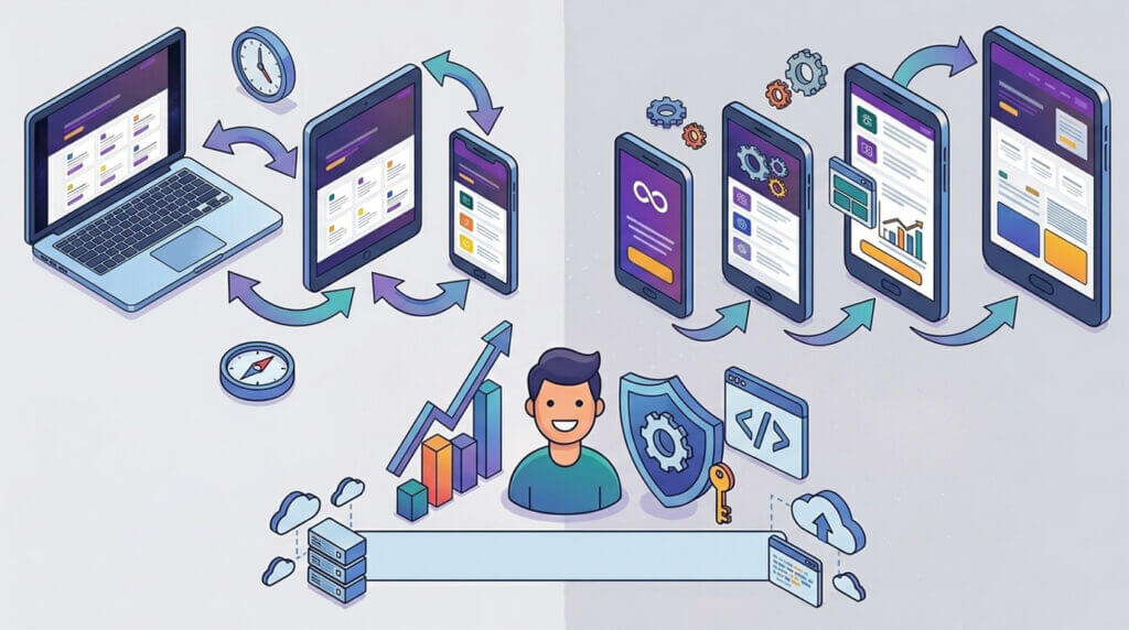
Responsive design is an approach where a website is built for desktop first, then adapted to smaller screens using CSS media queries. The layout “responds” to the screen size, adjusting columns, images, and fonts as the viewport shrinks.
A responsive site typically:
- Starts with a full desktop layout.
- Uses breakpoints to reorganise content for tablets and phones.
- Scales images and elements to fit smaller screens.
This approach was a major step forward when it emerged, and it’s still widely used today. However, it has a fundamental flaw — mobile is treated as a scaled-down version of the desktop experience, not a purpose-built one.
What is Mobile-First Design?
Mobile-first flips the process entirely. Instead of starting with desktop and working down, developers design and build for the smallest screen first — then progressively enhance the experience for larger screens.
A mobile-first approach means:
- Core content and functionality are prioritised from the start.
- Styles are layered on as screen size increases, not removed as it decreases.
- Performance is optimised for slower mobile connections by default.
This isn’t just a design philosophy — it’s a development methodology that leads to leaner, faster, and more focused websites.
Why Does It Matter for SEO?
Google uses mobile-first indexing, meaning it predominantly uses the mobile version of your site for ranking and indexing. If your mobile experience is an afterthought, your search rankings will reflect that.
Mobile-first design supports SEO by:
- Improving page load speed on mobile networks.
- Reducing layout shifts and rendering issues.
- Ensuring content hierarchy is clear on smaller screens.
💡 Bonus: Core Web Vitals — Google’s performance metrics — are heavily influenced by mobile performance. A mobile-first build gives you a head start.
The User Experience Difference
Consider how people actually use their phones. They’re browsing quickly, often on the go, with one thumb. A desktop-first responsive site frequently carries unnecessary weight — oversized images, complex layouts, and features that don’t translate well to touch screens.
A mobile-first site asks better questions from the beginning:
- What is the most important action a user needs to take?
- What content is essential, and what can be secondary?
- How does this element behave with touch instead of a cursor?
The result is a cleaner, faster, more intuitive experience for the majority of your visitors.
Performance and Page Speed
One of the most practical benefits of mobile-first development is performance. When you build desktop-first, you often load large assets and then hide or override them on mobile. This wastes bandwidth and slows load times.
Mobile-first best practices include:
- Loading lightweight assets by default and serving larger ones to bigger screens.
- Using modern image formats like WebP with responsive sizing.
- Minimising render-blocking scripts and stylesheets.
- Leveraging lazy loading for images and off-screen content.
Faster sites mean lower bounce rates, better conversions, and happier users.
When Responsive Design Still Makes Sense
Mobile-first isn’t always the right answer for every project. There are cases where a desktop-first responsive approach remains valid.
Consider responsive design when:
- Your audience is predominantly desktop-based (e.g., enterprise dashboards or complex SaaS tools).
- You’re updating or maintaining an existing desktop site.
- The core functionality relies heavily on features not suited to mobile (e.g., data-heavy admin panels).
The key is knowing your audience and making an informed decision — not defaulting to desktop out of habit.
How Infinity Studios Approaches It
At Infinity Studios, we take a mobile-first approach on all new builds. Before a single line of code is written, we look at your audience data, your goals, and the actions you want users to take. From there, we design and develop from the smallest screen up — ensuring your site is fast, focused, and built to perform across every device.
Whether you’re launching a new site or rethinking an existing one, getting the foundation right makes everything else easier.
Final Thoughts
Responsive design and mobile-first design are not the same thing — and in 2025, that distinction matters more than ever. Mobile-first isn’t just a trend; it’s the standard that modern users and search engines expect.
If your website was built years ago without mobile in mind, it may be time for a rethink. A well-executed mobile-first build doesn’t just look better on phones — it performs better everywhere.